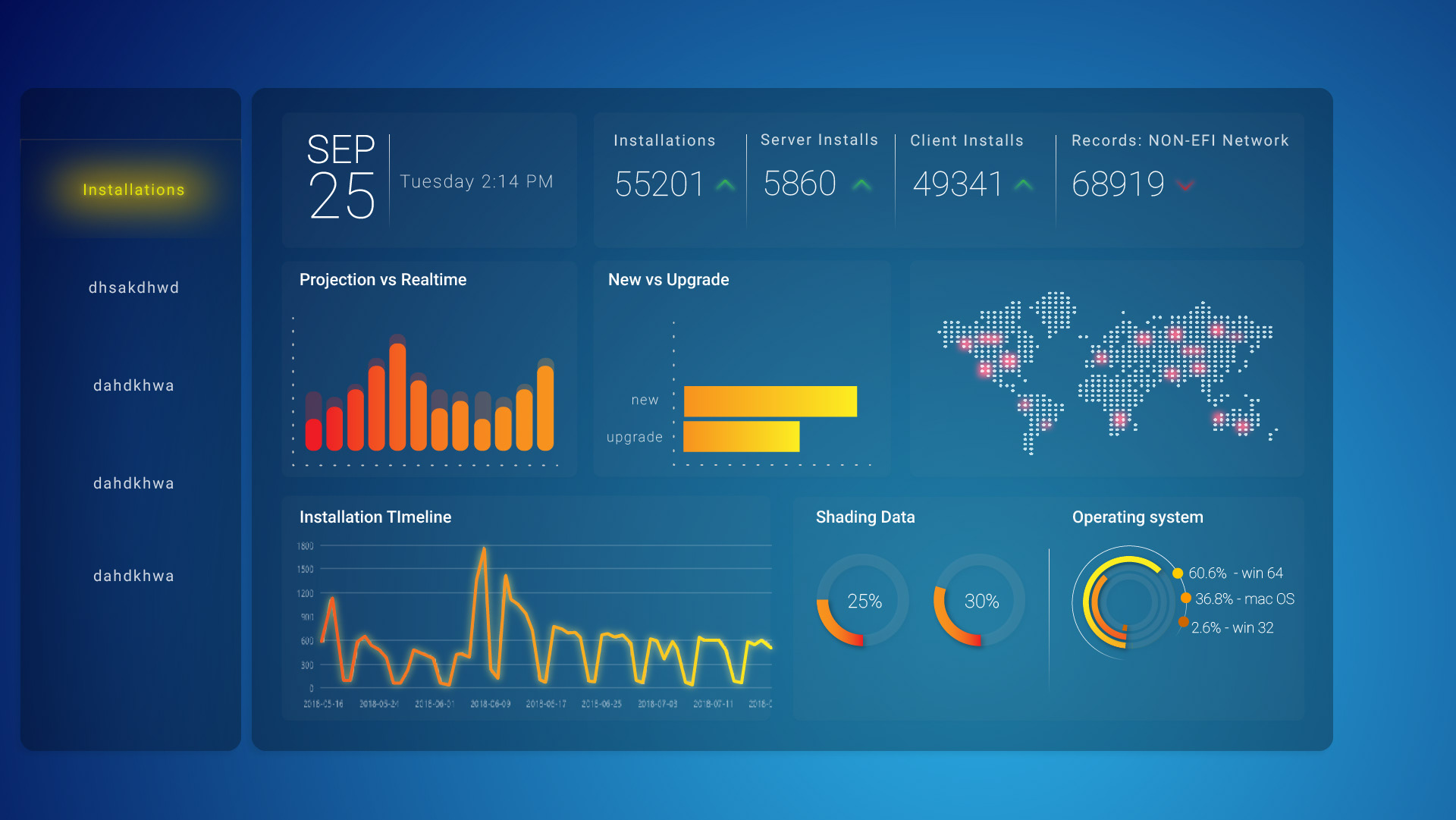
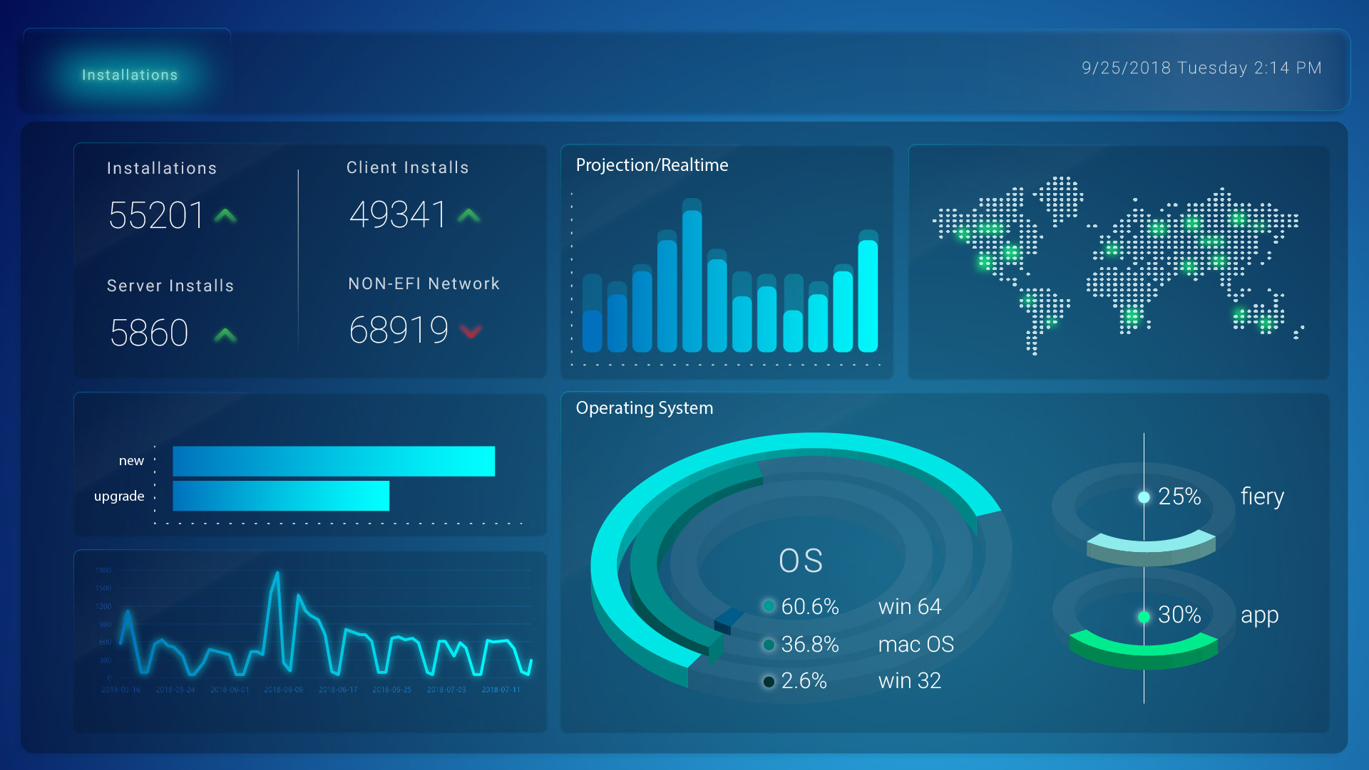
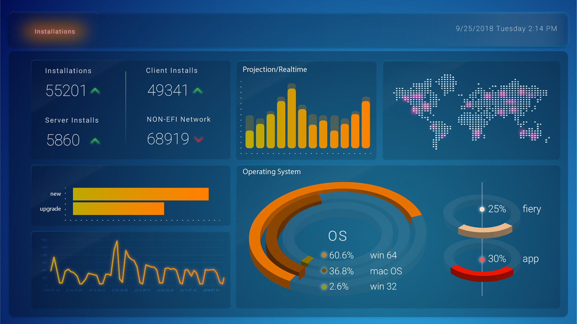
This was a mock for the EFI Fiery Dashboard. The concept was to create a Dashboard in which the user can see statistics on how well the product is doing. Fiery is the product that EFI has launched which is a an image rip system that sends an image directly from the computer to the printer. Here the user would view statistics such as install for client and servers. Where in the world it has been installed and what type of OS.

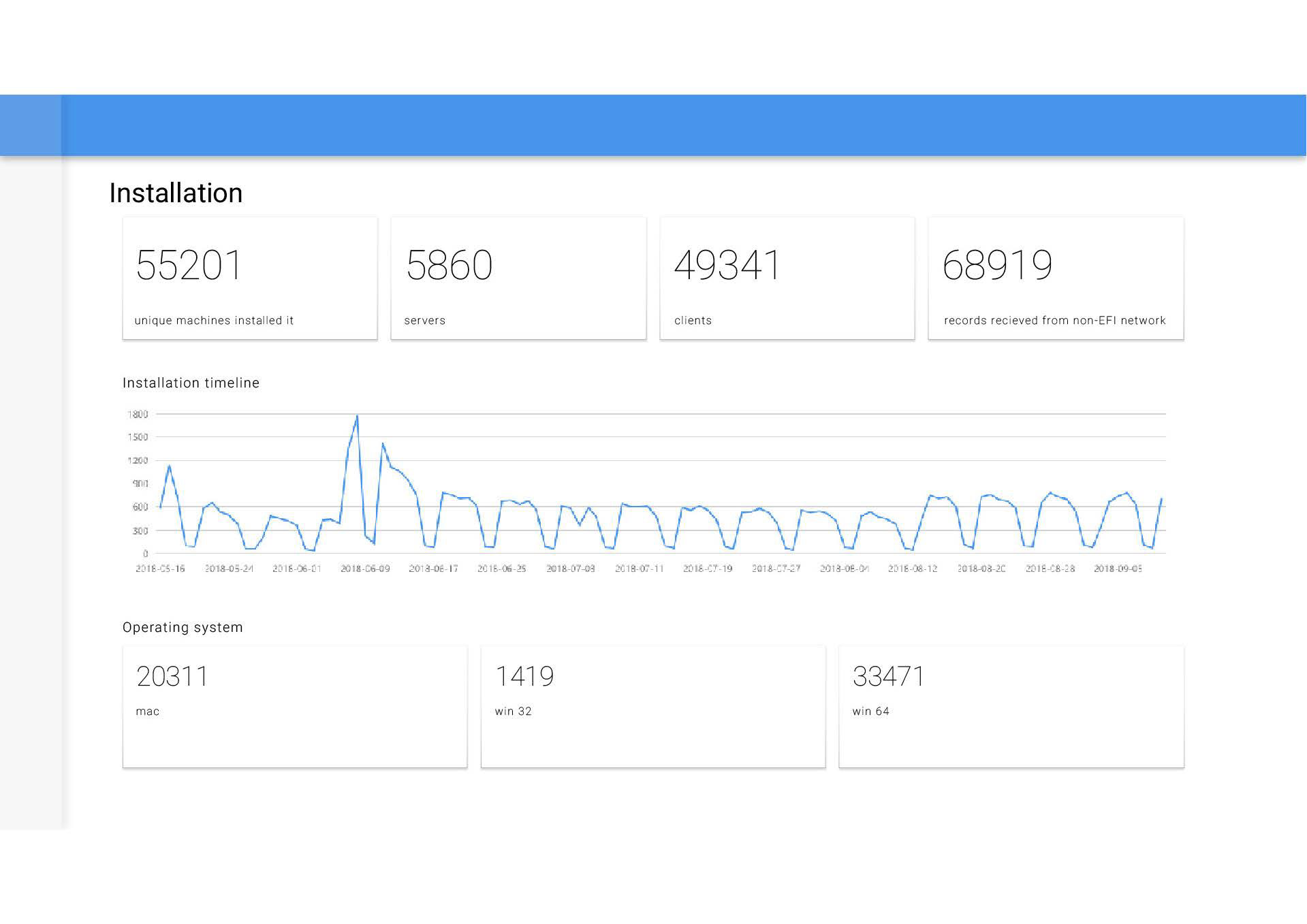
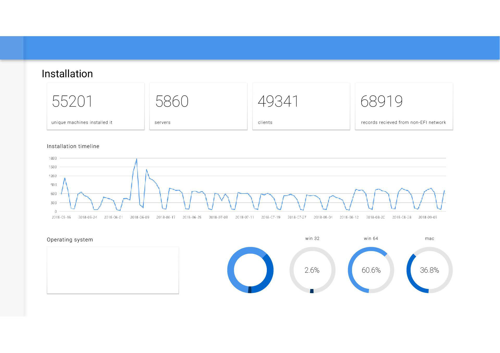
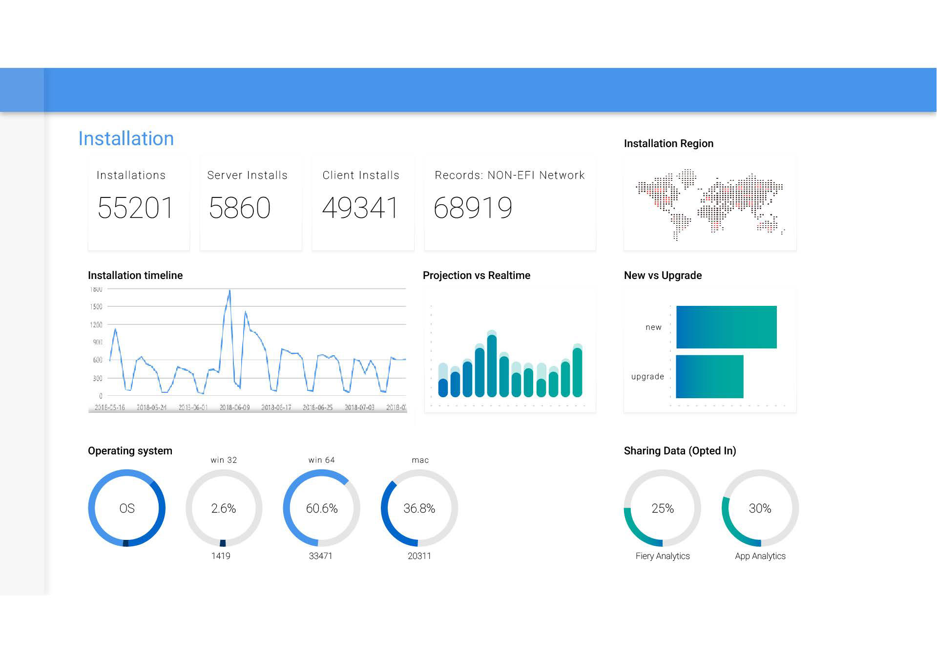
This was the original dashboard. It was very plain and while the information is clear and coherent, it was not exciting and would not create any intrigue for the shareholders and other investors in Fiery.


These were a few options that I created in the beginning. I did not want to stray so far away from the original, as I believed the hierarchy of information should be kept intact. I tried different color schemes and a dark version. Eventually I would go on to represent the data in different ways.
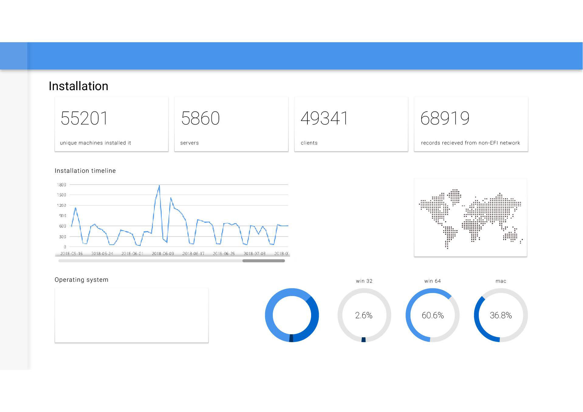
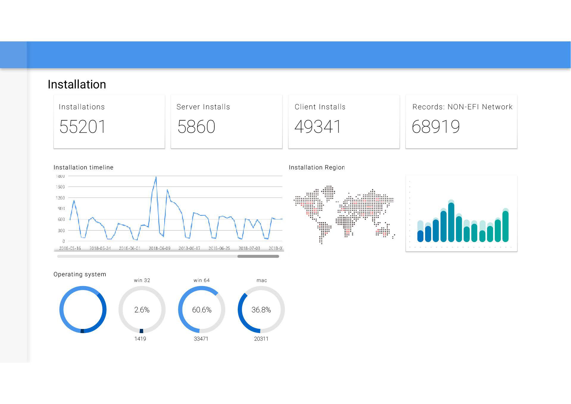
In the next set I started adding different data representations to should more perspectives and add color. I also tried working with different placements and grid structures. I would work on certain graphs as separate components and then arrange them.
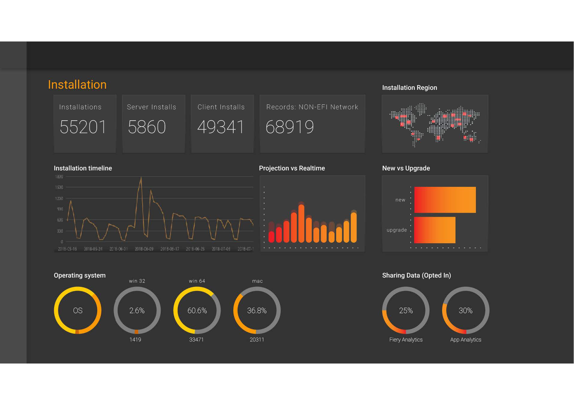
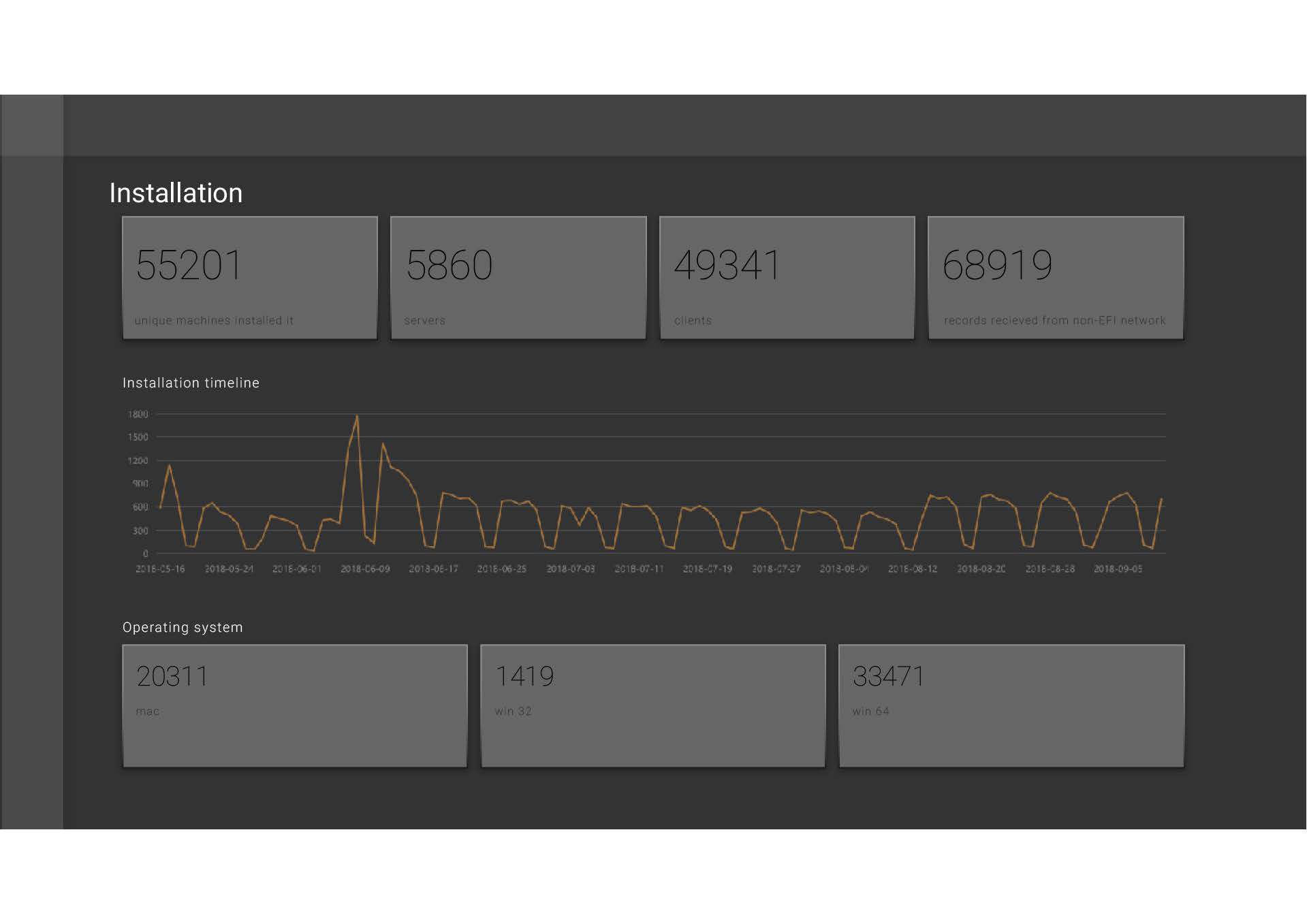
I eventually came to a more solidified design through a dark mode concept. The orange Gradient color for the data and the charcoal background provided a good contrast that could grab the viewers attention.


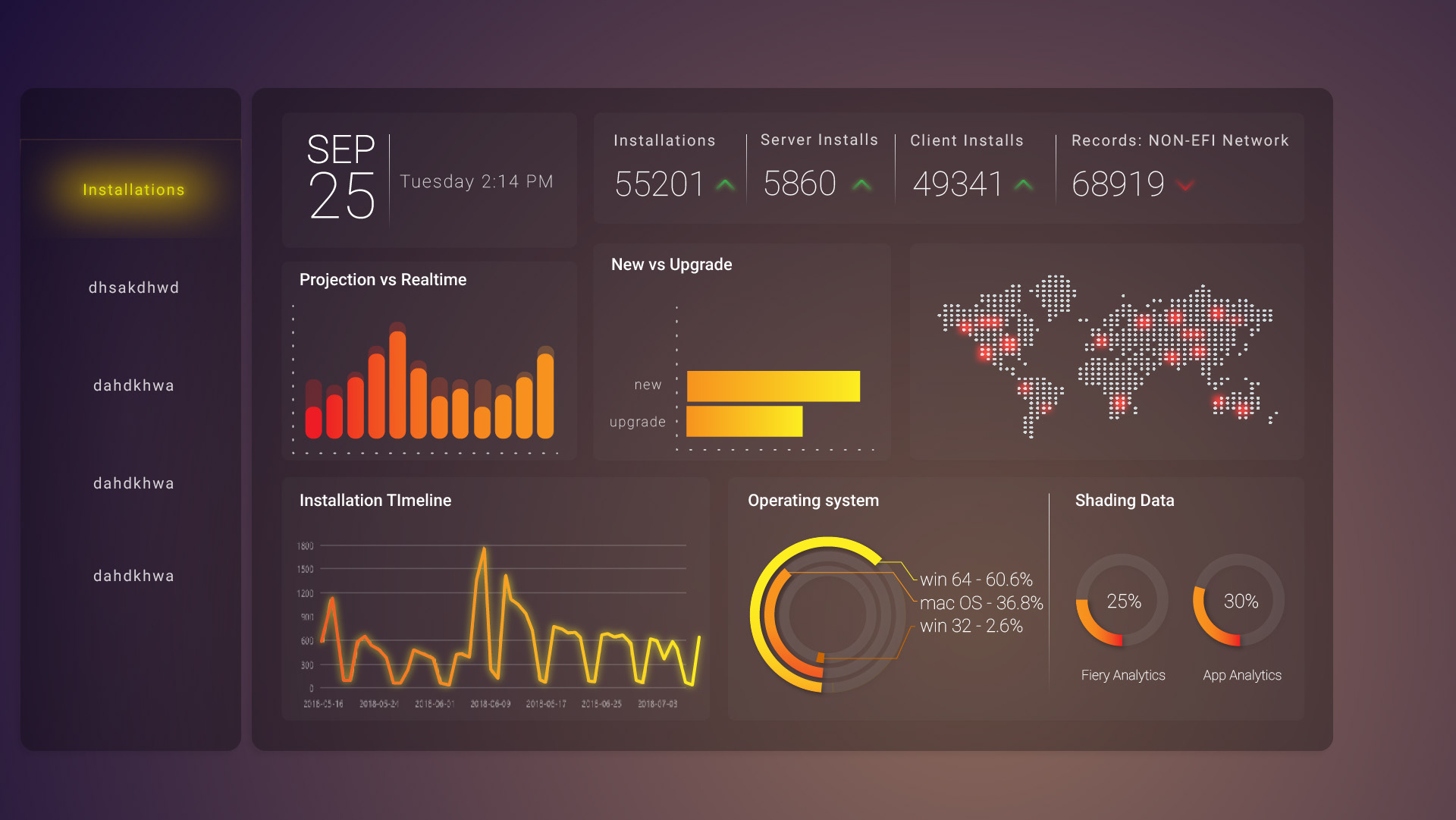
After a flat design was created and I got the hang of the components I was creating. I started working with gradients and transparency to create a dashboard inspired by the style used in Telsa Car screens. I worked with orange on blue as complimentary colors and then tried different background colors to break the scheme.
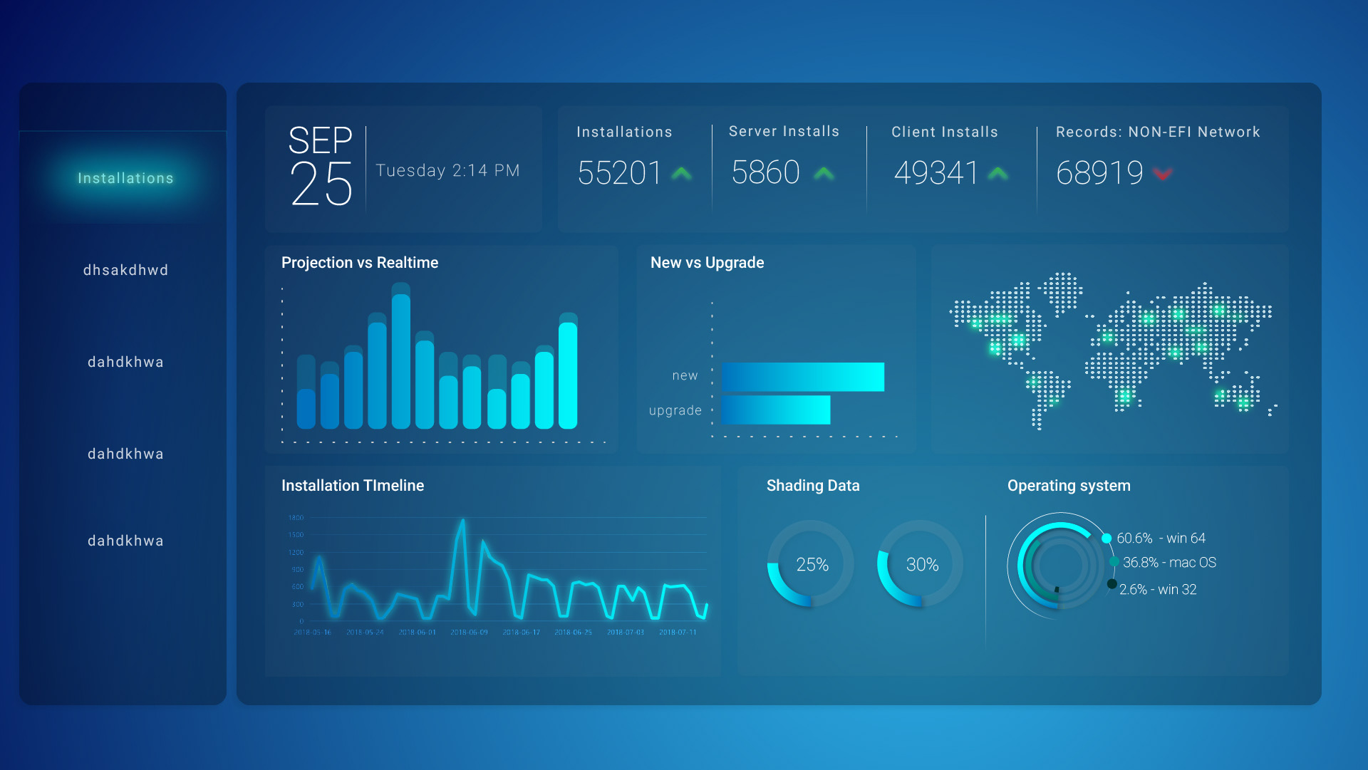
I tried a few different graph component layouts and styles and also experimented with a blue on blue color scheme for a more tranquil look and feel.
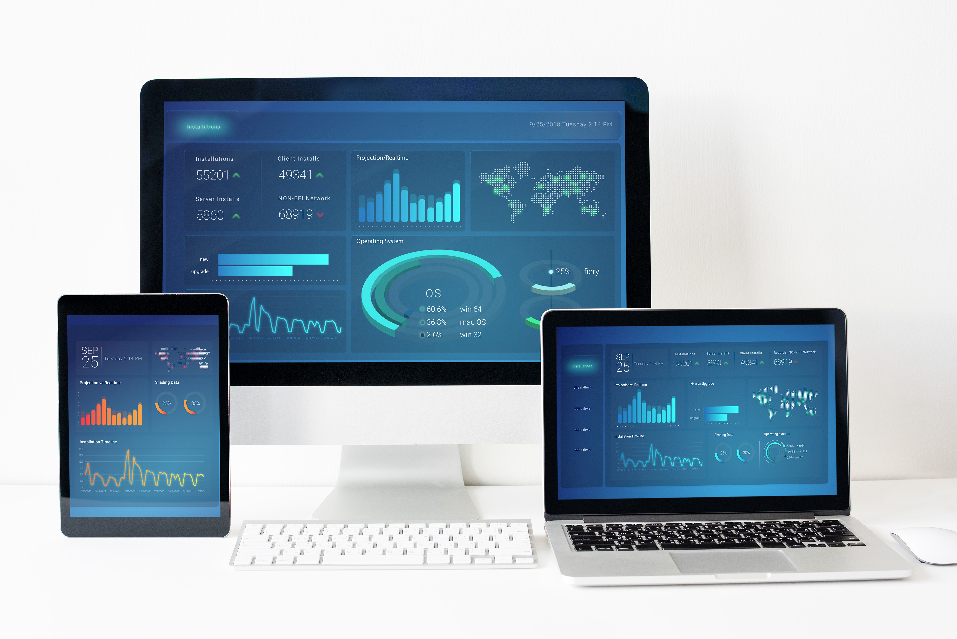
In the end I started working with more elaborate graph components and ventured into 3D representations which was the final piece. It would look more attractive and create a new perspective for visualizing data.