Creating the website was a challenging and rewarding experience because it taught me a lot about how e-commerce websites work.
While it was not my first experience with a designing a website, it was the first time I was in charge of re-designing an e-commerce website. There were and still are many things I did not know and had to learn.
My Design Approach: Asking Questions
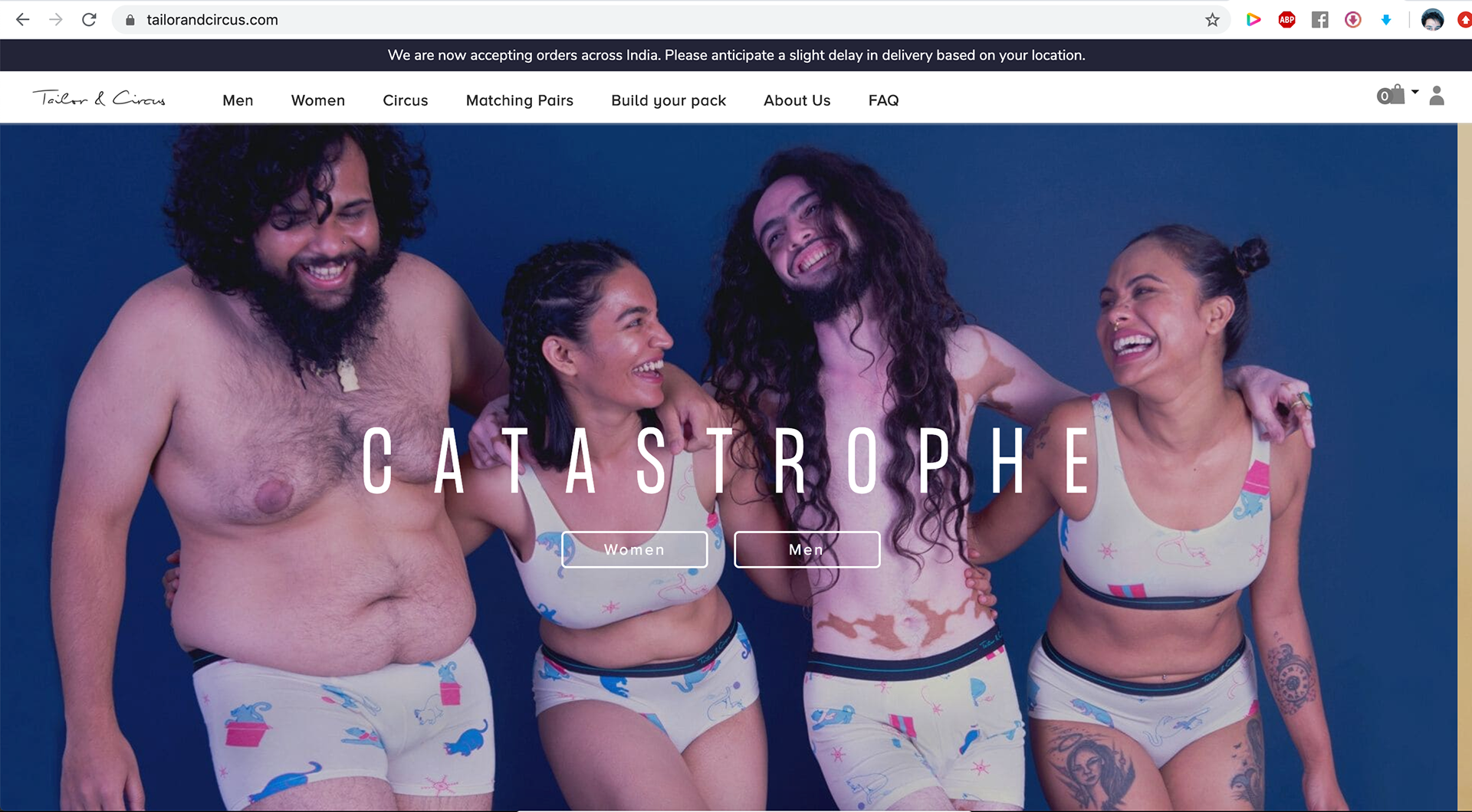
The biggest difference between designing and re-designing something is existing data. In this case Tailor & Circus already had an existing website, with an inventory, pictures, content, and reviews. They are budding startup with an established customer base and have been on the web for at least 2 years.
Half the battle is asking the right questions to frame your direction.
The context of the situation also determines the circumstances.
Do I start with a clean slate? Should I make minor changes?
How can I change something with the least disruption?
What interactions should I change and what should stay the same?
How do we create design changes for customer acquisition while retaining our existing customers?
What already works for other e-commerce inner-wear brands?
How do other successful brands curate their webs experience?
What do our competitors do?
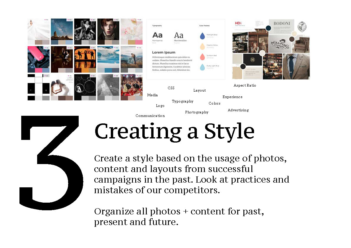
Competitive Analysis
The team had a meeting and began showing me examples of brands that have set an example for guidance.
I decided to look at their experiences on mobile and desktop and take note of their informational architecture and what the browsing experience was like.
My Design Approach: 5 Step Plan

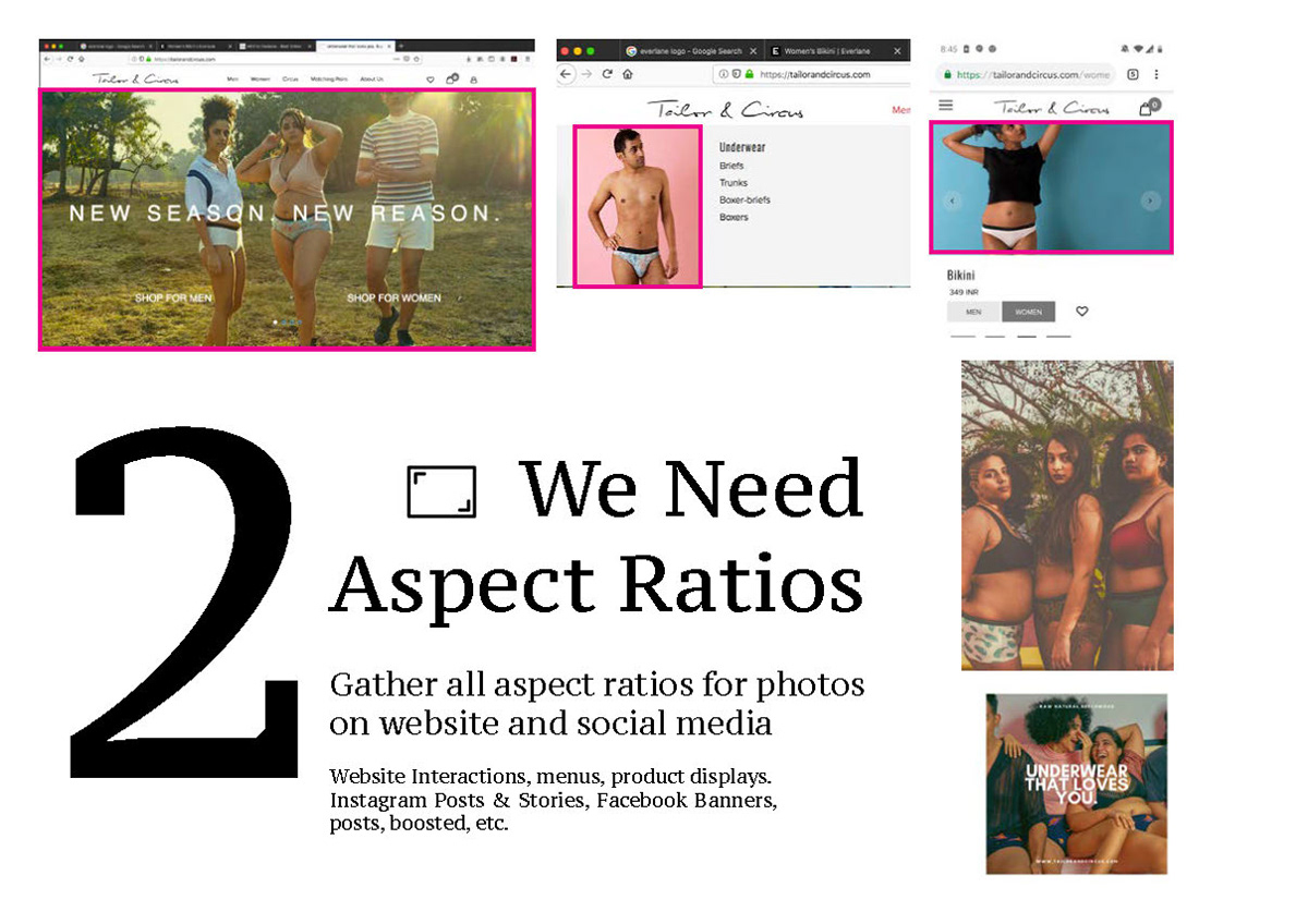

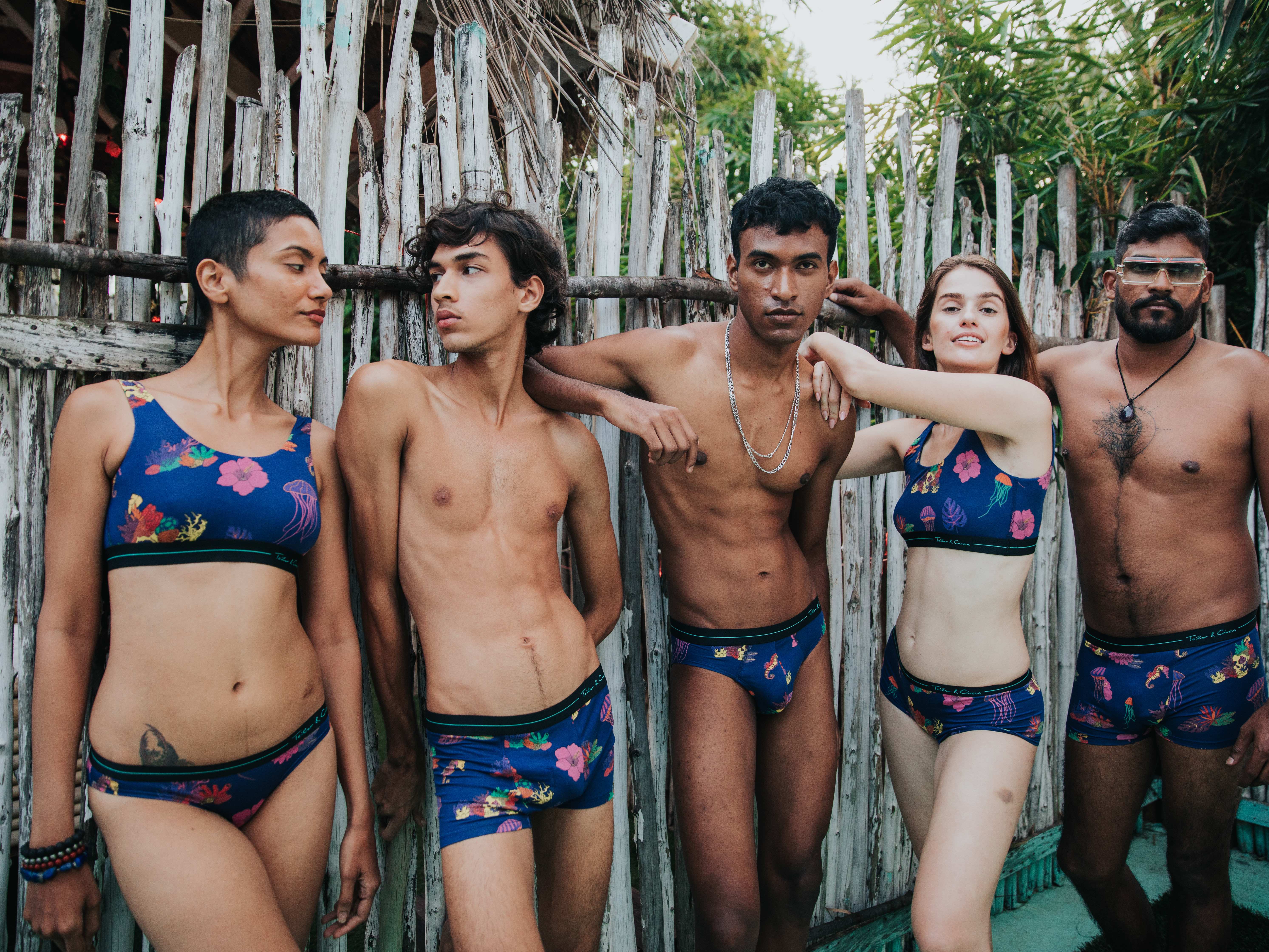
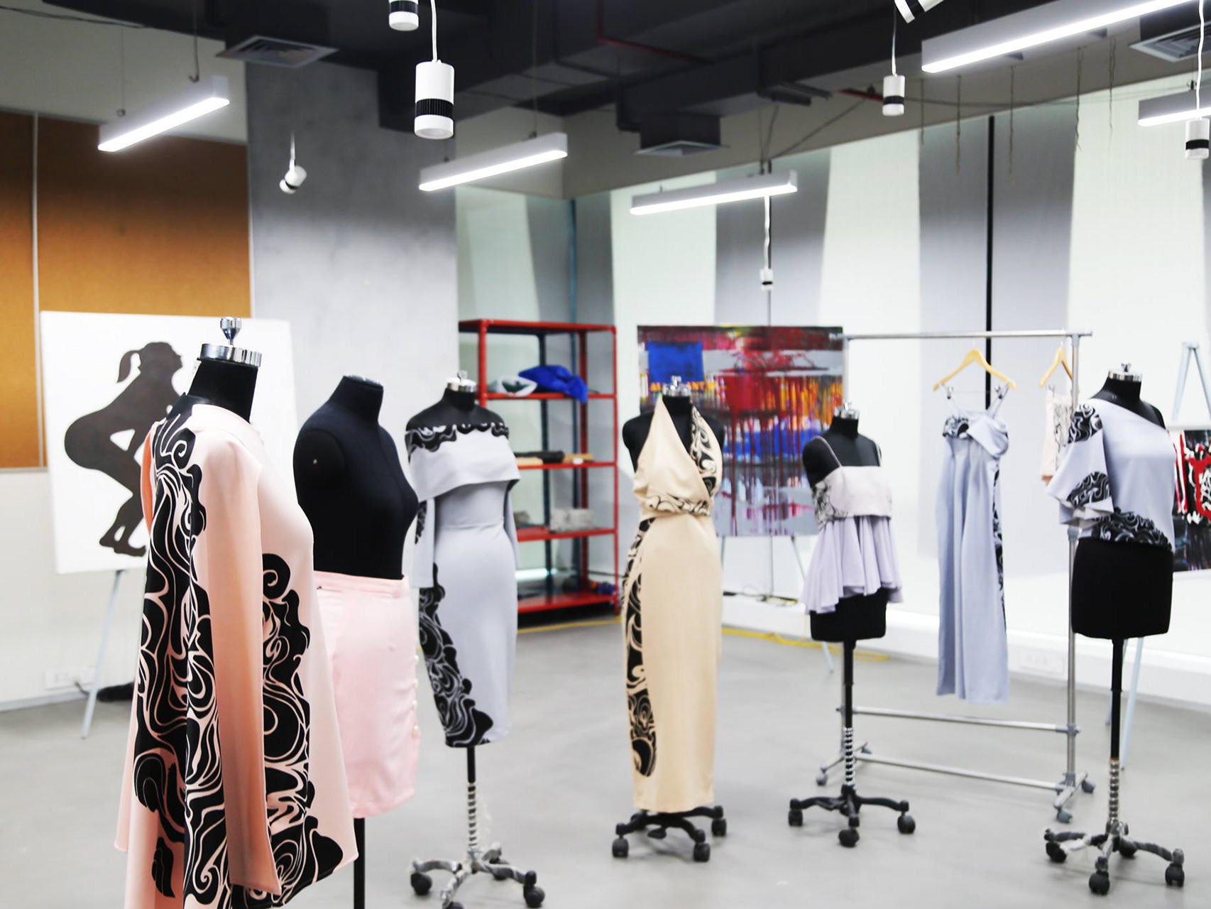
The first thing I noticed about Tailor & Circus and most e-commerce websites is their use of photography. The image is the main crux for marketing and advertising for the product, therefore I felt that we needed to base our web presence around the existing photography and what we plan to shoot in the studio.
The next step was to organize and tag images into different buckets of use such as IG vs Website or. I wanted to separate images based on aspect ratios which was a good thought in the beginning but ended up quite difficult to maintain. In the end we divided them based on a different set of parameters: landscape vs portrait, catalog vs outdoor, group vs solo (how many people in the shot), and product with print.
By doing this and creating an online drive with Zoho our team could then easily access the photos with a reasonable internet connection.
Reflection
Designing the UI/UX is a monster task that bleeds across into other design disciplines. Looking back there are better approaches I could have taken into designing the website. I feel the biggest change I will incorporate into my process is first looking at the devices that we use the most across different demographics and socio-economic groups.
Since it is a digital storefront, we have to look at the devices we use to access it. Phones have gotten much bigger in the last couple years and change the responsiveness. Websites have to adapt to different display ratios and therefore we have to create interactions that are easy for people to use.
While newer larger screen phone provide a better viewing experience, engaging with them is now becoming tougher. Menus in the top right or left corner are hard to reach with ones' thumb leading this interaction to become a two handed experience more often than not.

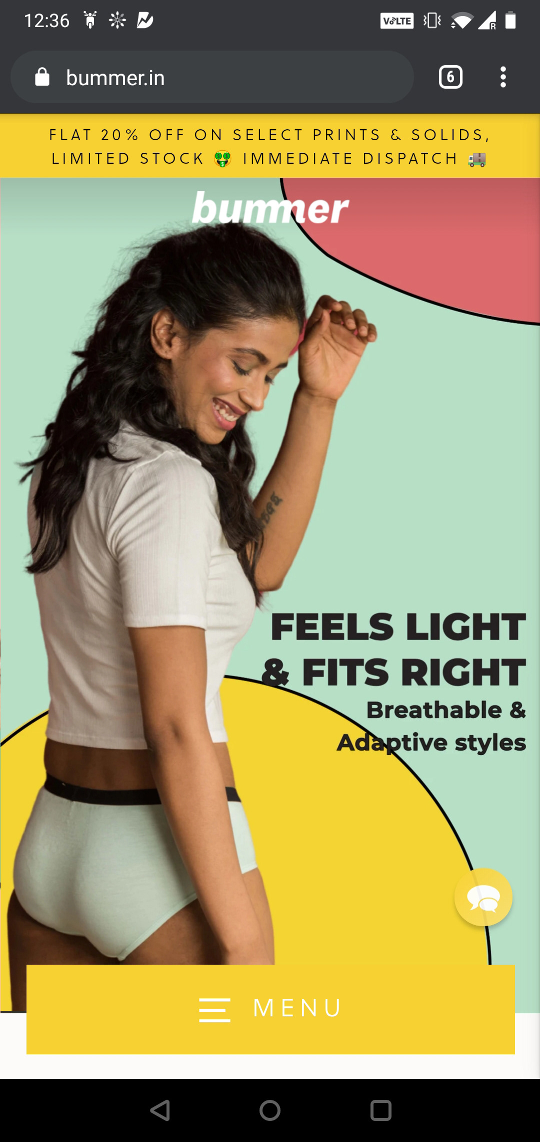
A recent example I saw from a new competitor is from Bummer.in
They created a menu that is pinned to the bottom of the screen.